- Client
Mindvalley Labs
- Services
BlinkWebinar Platform | UI Design, Branding
Few words about Mindvalley
Mindvalley calls itself an innovative personal transformation learning platform covering all the essential life skills that regular education ignores.
Mindvalley is a learning experience company that publishes ideas and teachings by the best authors in personal growth, wellbeing, spirituality, productivity, mindfulness, and more – and combines them with cutting-edge sophisticated learning technology within engaged and supportive communities.
This company lets you consume the knowledge with utter comfort, providing one of the progressive engaging learning tools for a seamless experience and rapid uptake.
About the Project
The Project’s focus was dedicated to a Redesign of the Webinar Platform (Webinar CMS) Interface. As we all know, CMS is a computer software system that manages and organizes the creation, modification, and publication of digital content like documents and images, often in a collaborative environment, for presenting to a website/digital resource.
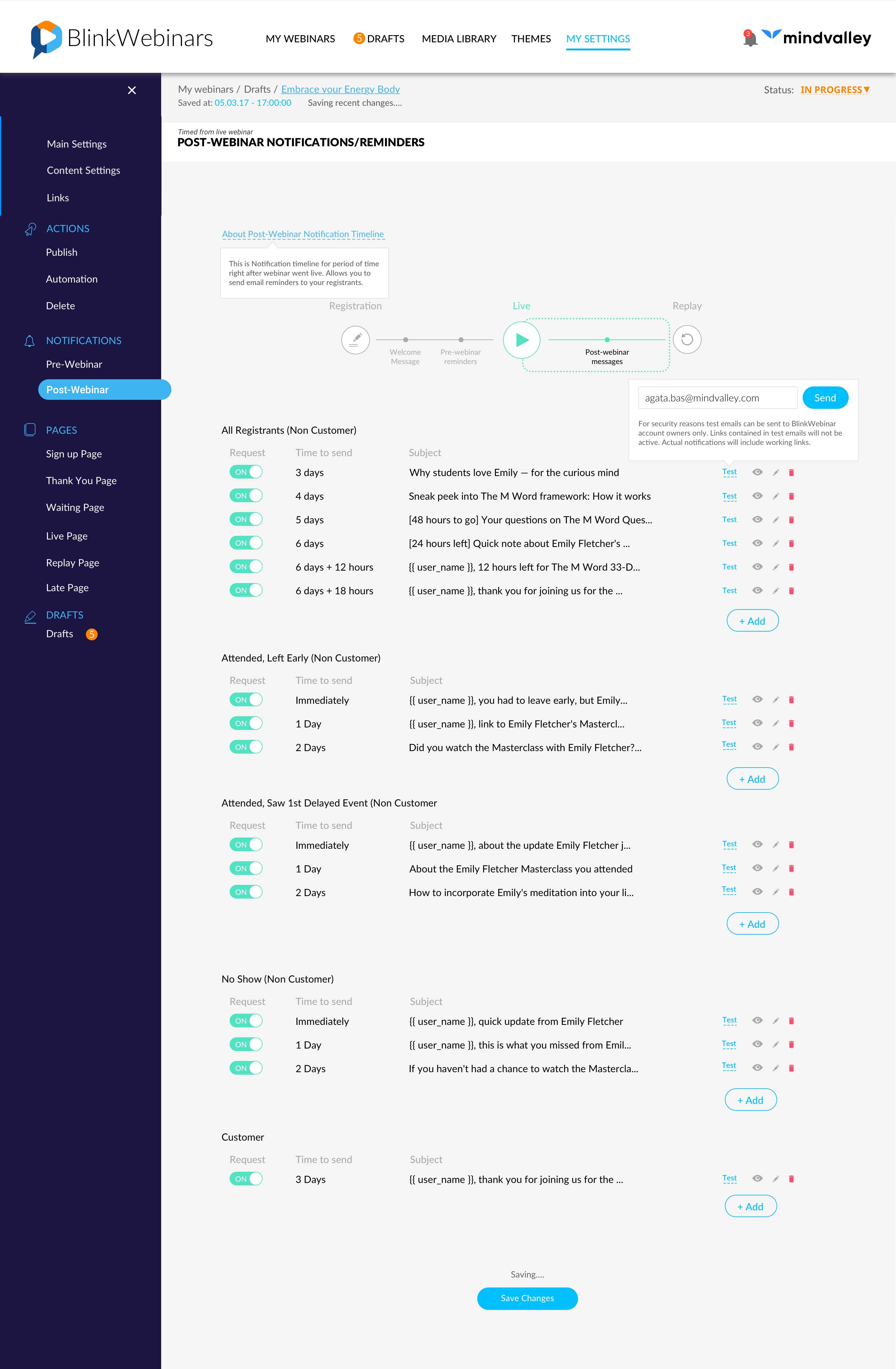
The platform is called BlinkWebinars. It is internal CMS for holding webinars, launching live masterclasses, and managing pre workflow and post-webinar workflow (User Engagement Period).
Since Online Events is the focal business focus – 😎 main profit for the Company 😎, webinar editors/content managers have to operate with the CMS day in and day out by setting up upcoming webinars and launching it for the end-user.
That means, that by working and improving the usability of the interface, we directly impact points like:
- Quality (fewer mistakes, fewer editing through simpler, faster, and more enhanced experience);
- Speed (through time spent to create the webinar template or prepare all the marketing cycles to promote the masterclass = design needs to be informative and readable, so the interface is felt seamless, intuitive, highly accessible, and easily editable;
- Profitability as a result 😁!
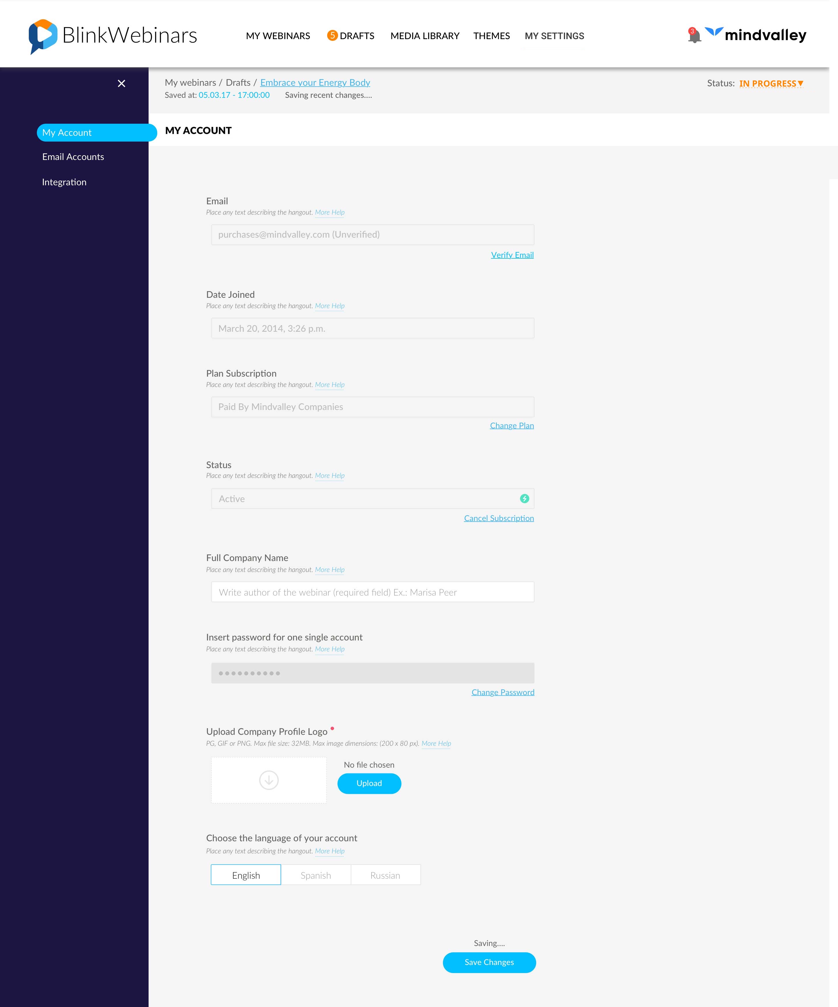
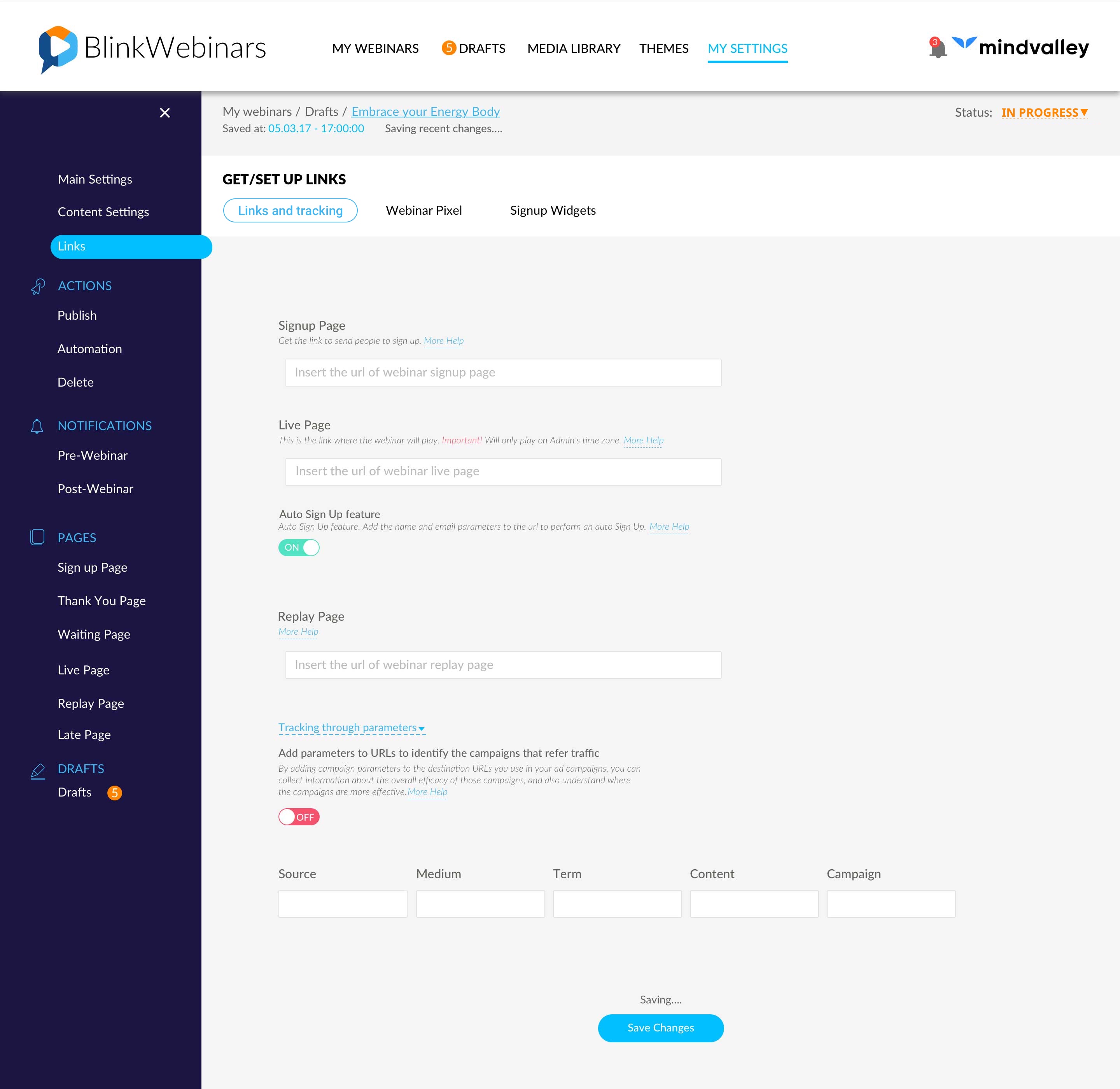
It is very important to highlight, the whole CMS relies on forms for any of the primary tasks users will have to perform-from creating and editing content to reviewing it.
Marketers, editors, and other content creators will interact with it frequently. In fact, they’ll use it on a daily basis and for a work environment. That means I and my team have to create an experience where our users can be productive and feel comfortable with it. Thus, ubiquitousness and frequency of use are two main pillars when designing forms for CMS.
The interface consists of:
✌️Multiple advanced settings;
✌️Various types of data;
✌️Various types of input fields;
The focus was on simplifying the webinar setup process by improving the data visualization and intuitiveness (clear expectations of certain interactions) – all to make CMS Interface user-friendly and far beyond just a boring business tool definition.
To achieve that, I had to apply best practices of form design, simple rules that help me design forms that are liked to be completed.
There are a lot of different things to consider when designing for complex data, some of them are listed below:
- Text field component design should provide a clear affordance for interaction, making the fields discoverable in layouts, efficient to fill in, and accessible;
- The colour scheme needs to be clean and quick to understand;
- Visual Feedbacks
- Assistance and help messages
- Prominent search bar
- Filters
We always try to think outside the box and be very creative, but with the understanding that clarity and accessibility are key for all users to get the most out of the design.
The End Result
The Design of the CMS Interface and its experience has been Refactored in a way to skyrocket intuitiveness level and design distinct usability forms.
Roles I assumed during the process:
Researcher | UI Designer | UX Designer | Project Management